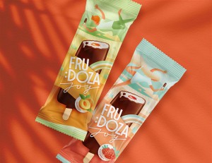
Color! Color! Color!
Frudoza brand emanates positive vibrations – the packaging of ice cream with layers of sorbet with berry and fruit pieces gets a new look.
Project:

The starting point is changes in the packaging format and the product positioning: a paper cup becomes smaller and now there is a wooden spoon under the lid. This portion can easily be consumed by just one person, out of home and on the go. Such an ego-format : )


The visual solution is based on the contrast of bright colors: an immodest number of berries and fruit in the ice cream calls for a juicy palette. While for others it may be defiant, for Frudoza brand it’s natural.


The ice-cream ball is the gravity center, around it the “universe” is unwinding: fruit and berry pieces, logo typography. The decision to use the key composition twice takes into account possible layout methods. The cup side and the lid work equally efficiently.


A wide confident smile : D shines in an updated brand logo to boost the “Juicy portion of happiness” brand idea. Also, the identity becomes dynamic. Packaging, souvenirs or promotional materials – the logo flexibly responds to any format.